Fintech Onboarding
Sign-up, verification and back-office vetting for a mobile money platform
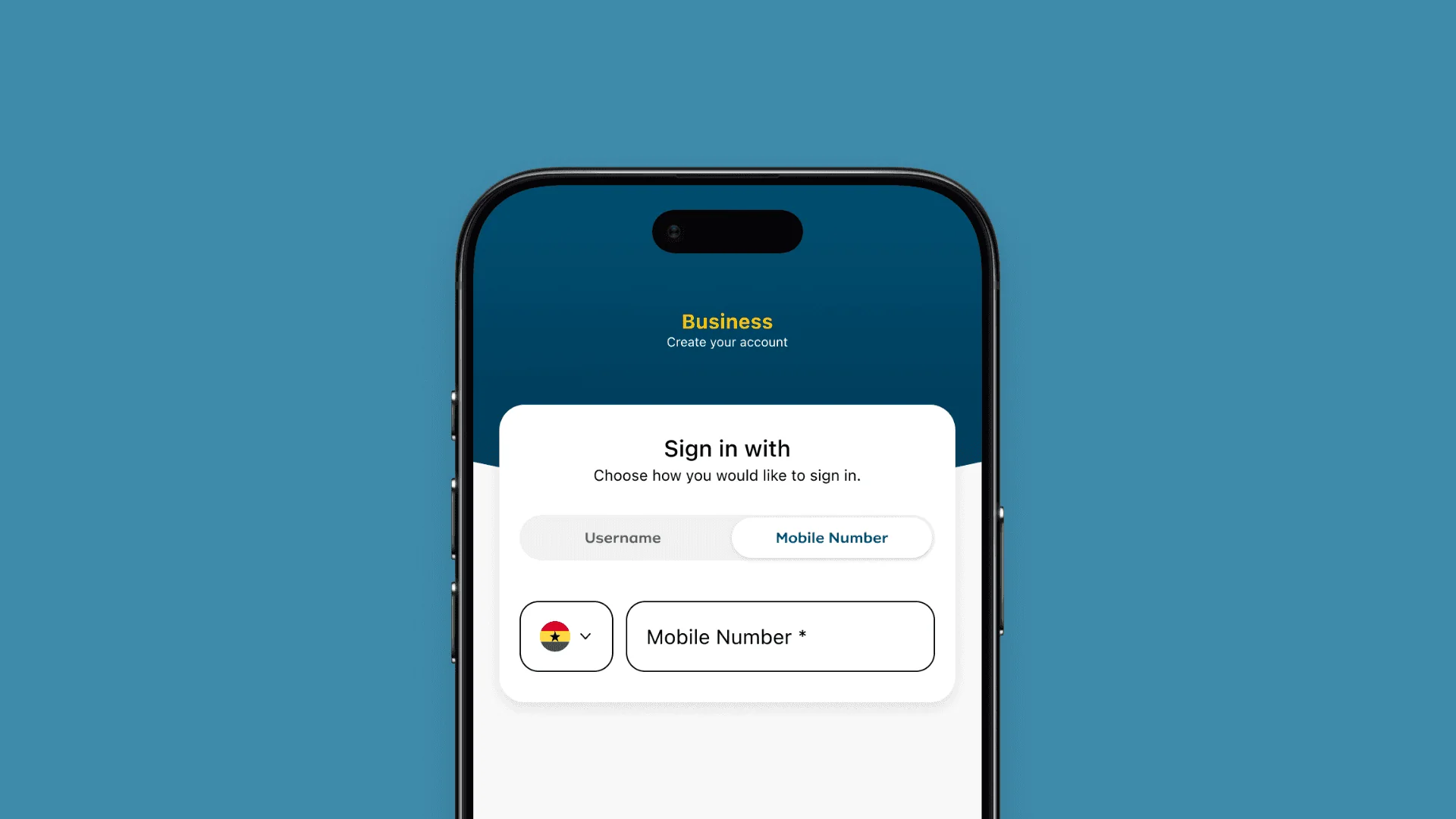
Onboarding that happened outside the product
New users signed up through a manual process, even though they already had the app in their hands. Behind the scenes, the back-office team had to vet every new client at scale, and anyone who failed a check met a dead end.
All of it had to work across four countries, each with its own rules, languages and kinds of users.
What I was responsible for
I owned discovery, process mapping and UI design on both sides of the system: the customer journey on web and mobile, and the back-office portal that vets each client.
Map the old process before designing the new one
I started with how things already worked, then held every design decision to three goals: sign up without an agent, one product across four markets, and decisions that can be recovered.
Starting with how it worked already
Before designing anything new, I mapped how the backoffice team worked at the time. Every screen they opened, every question they answered by hand, every point where a decision stopped because the information they needed was somewhere else.
I also spoke to stakeholders in compliance, operations and engineering to understand what each market required and why. The new process came out of the old one rather than a blank page.
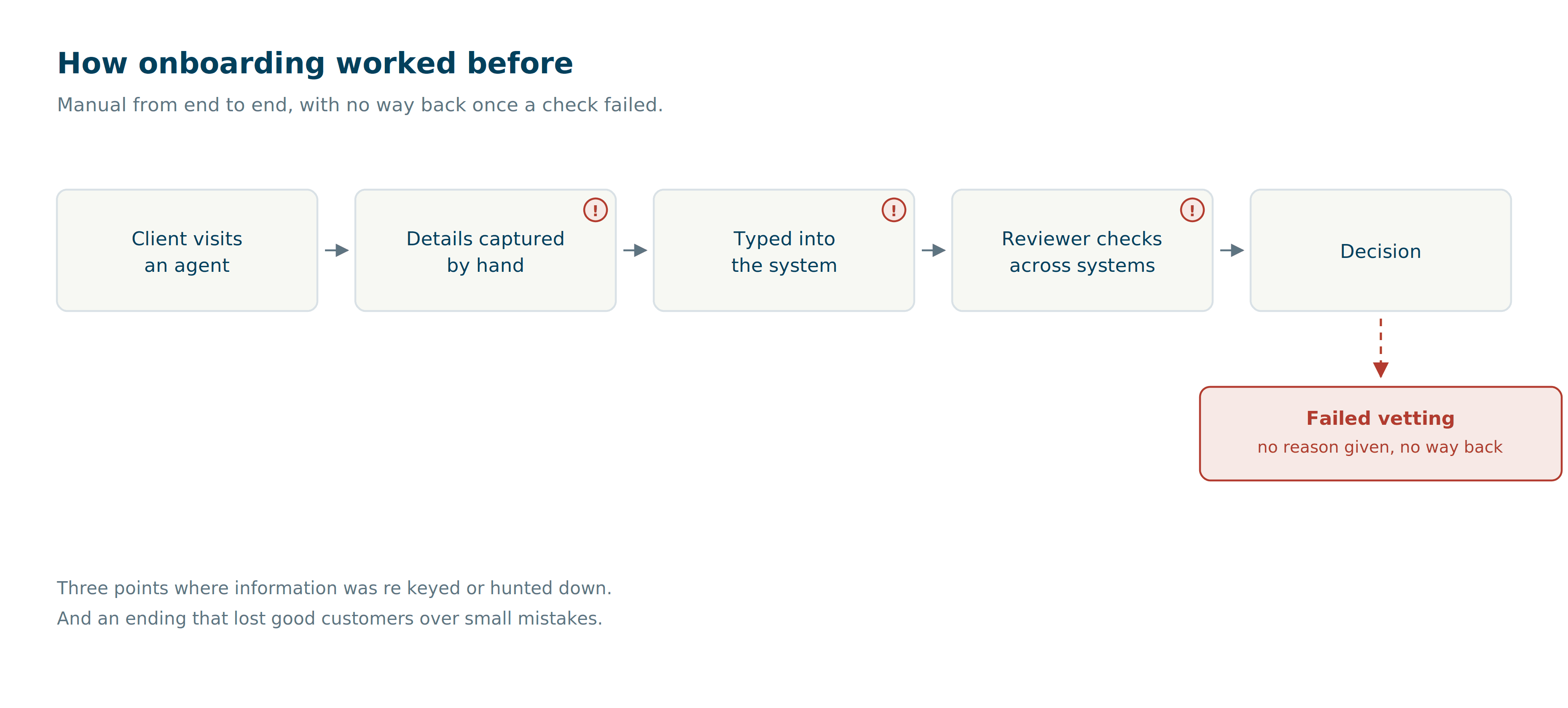
What surfaced
Onboarding happened outside the product
Every market had its own rules
Failing vetting was a dead end
Two audiences, opposite needs, one system
Merchants needed onboarding light enough to finish alone, whether they were a street vendor or a registered company. Reviewers needed density and context to decide quickly. And four markets needed all of it to work under different local rules without becoming four different products.
I set three goals to hold the design to.
1Sign up without an agent
2One product, four markets
3Decisions that can be recovered
Onboarding
Goals one and two. Moving sign up into the product, on web and mobile, across four markets that each had their own rules.
Four markets, one design language
I designed an onboarding journey that lived in the product itself, on both web and mobile. Same steps, same order, same design language, laid out for whichever screen someone had in front of them.
So I designed a fixed sequence with three defined points where each market sets its own rules: which verification steps apply, what documents are needed, and how identity is confirmed. The shape stayed the same everywhere. The local rules fitted inside it.
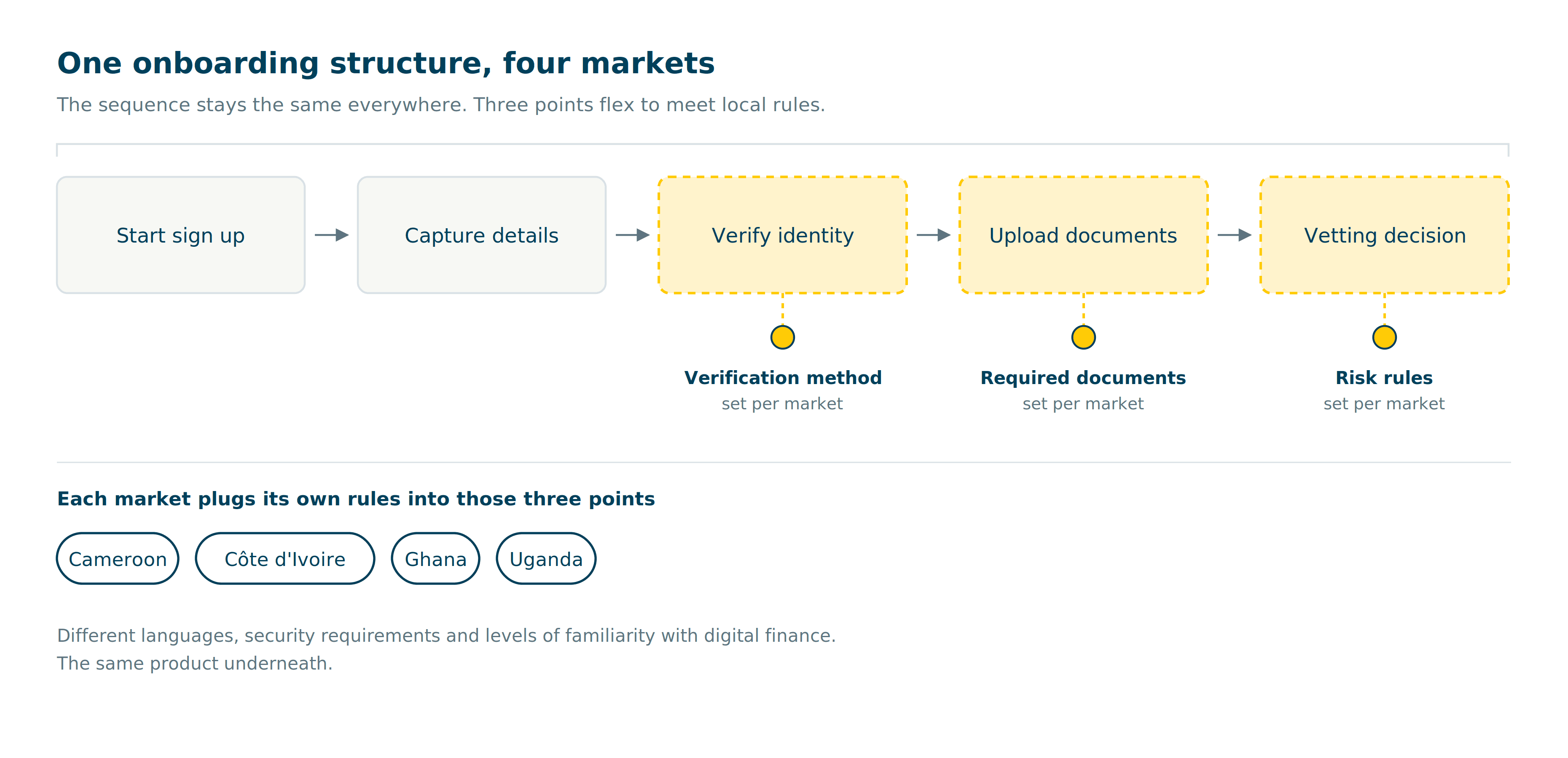
More work up front, and every market had to accept a shared shape rather than the one it would have designed alone.
Côte d'Ivoire and Uganda came first, so the structure had to hold up against two quite different markets before the other two were built on it.
One journey, two platforms
I designed an onboarding journey that lived in the product itself, on both web and mobile. Same steps, same order, same design language, laid out for whichever screen someone had in front of them.
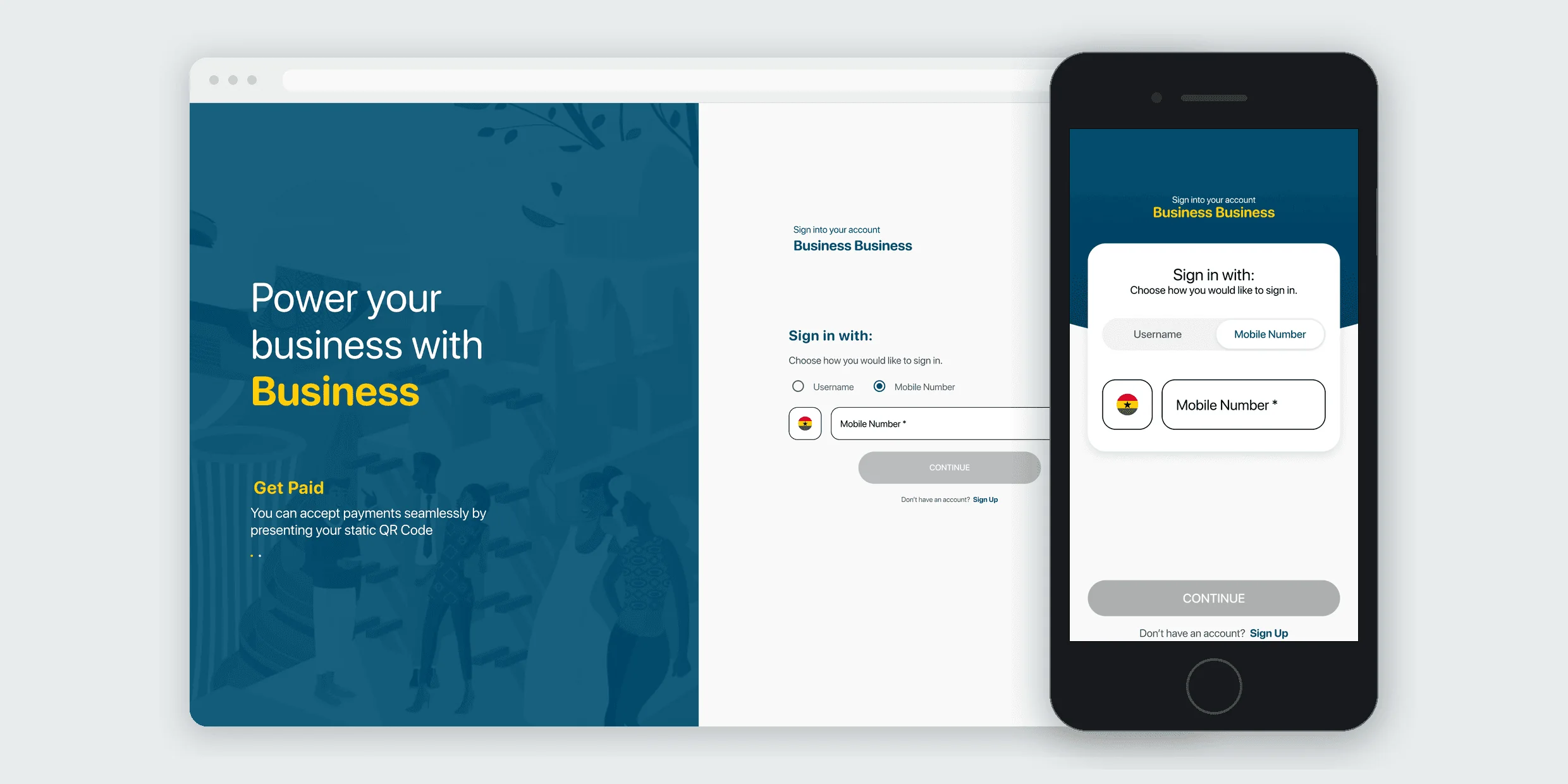
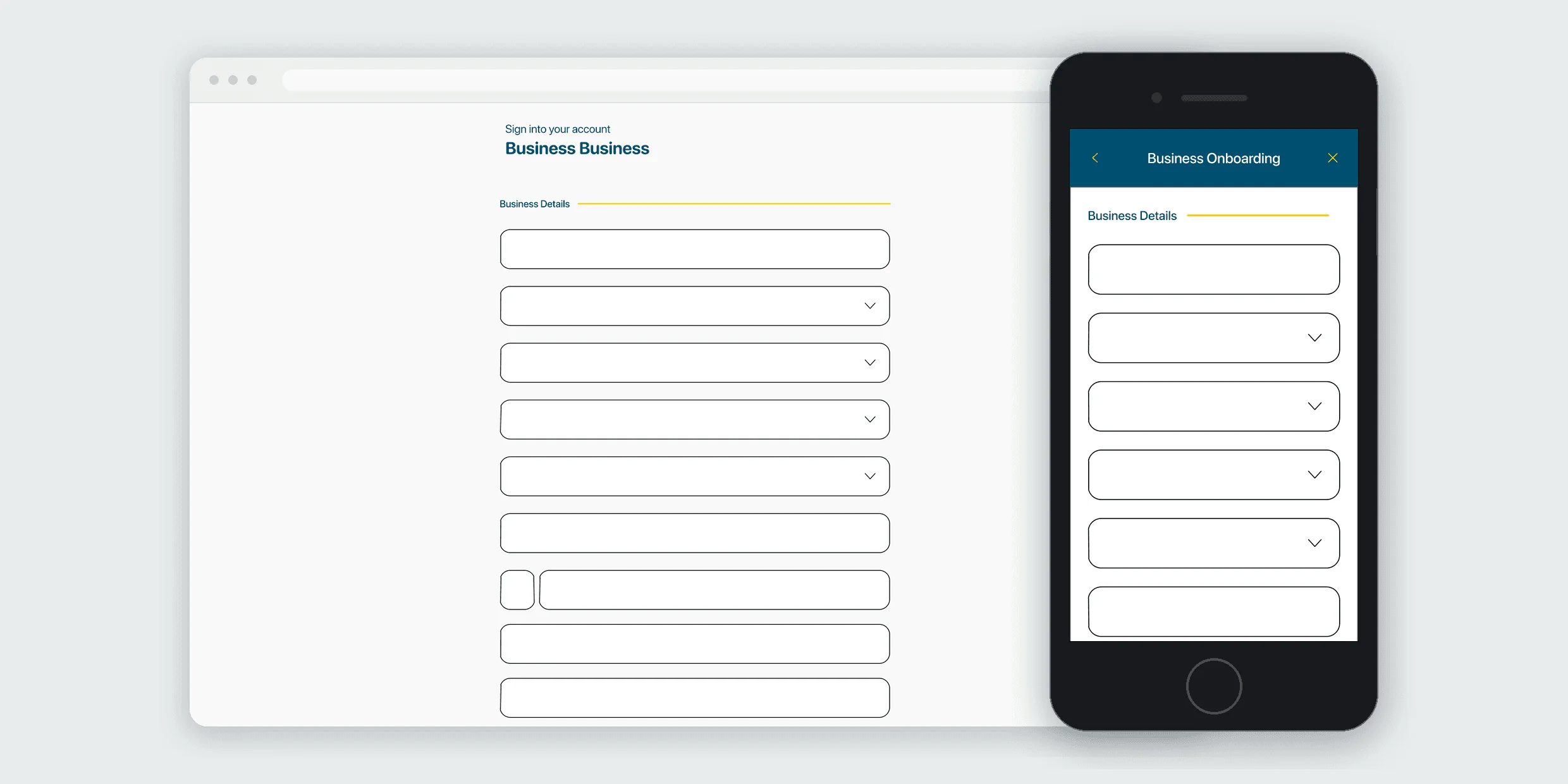
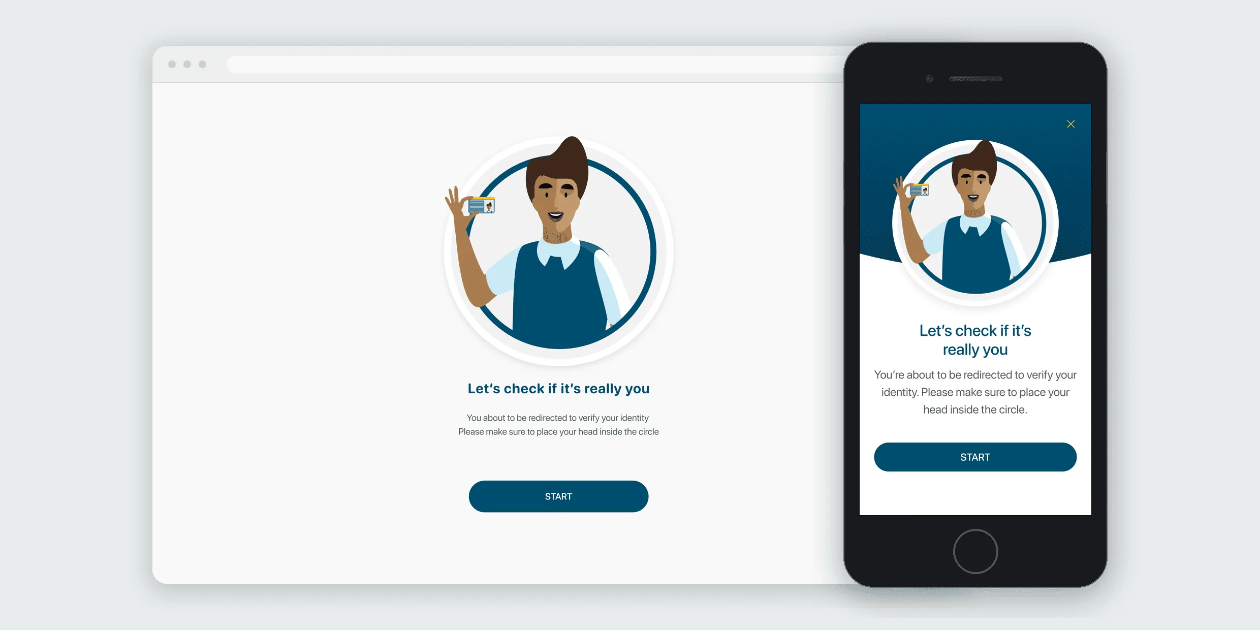
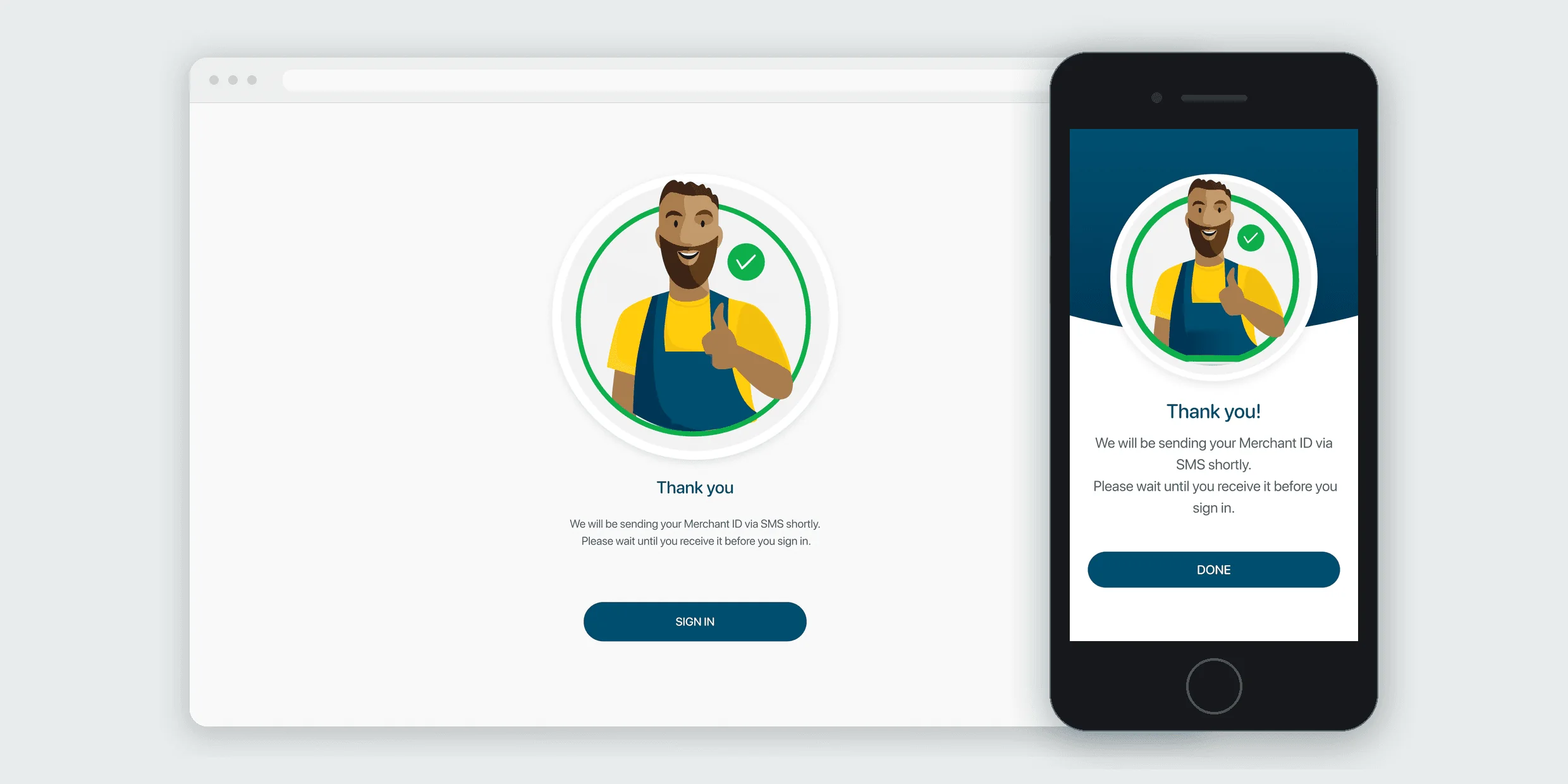
People could now complete onboarding on their own, at the time that suited them. Someone starting on web and someone starting on mobile met the same steps in the same order.
An interim site for Uganda
Uganda needed digital onboarding sooner than the full build could deliver it. Rather than hold the market back, I designed an early holding site within the public website covering the immediate need, built so it would not clash with the full experience when that landed.
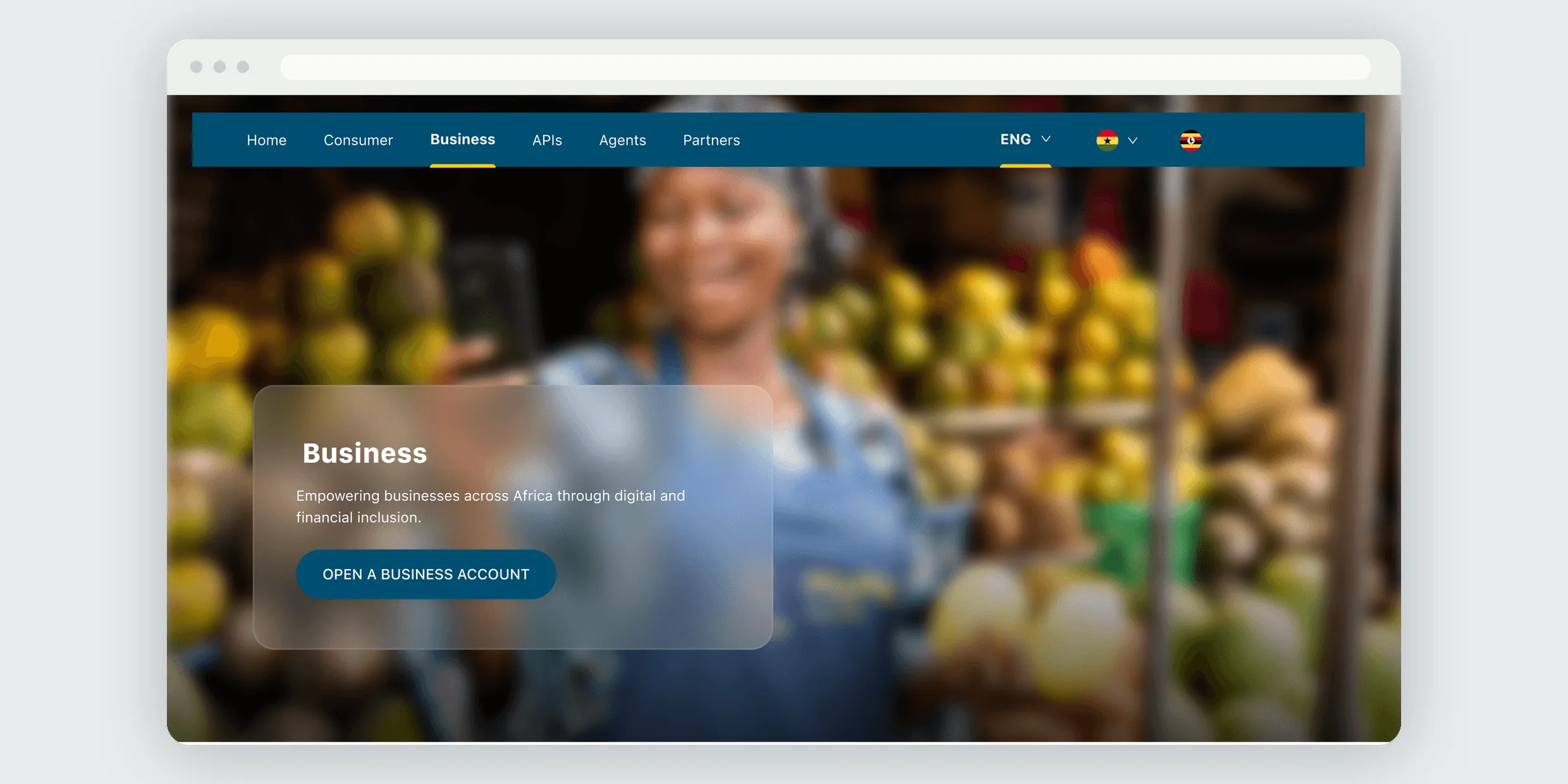
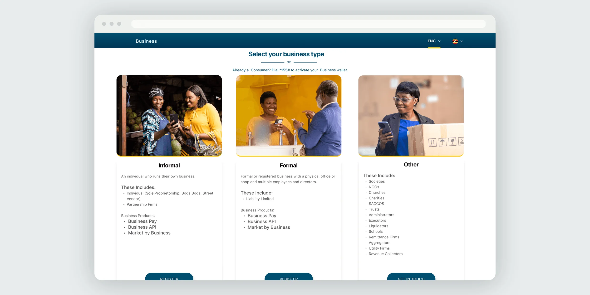
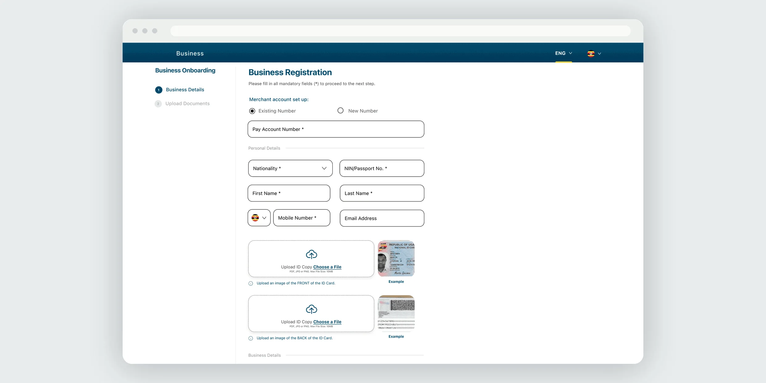
A second thing to maintain, and a transition to manage once the full journey shipped.
Vetting
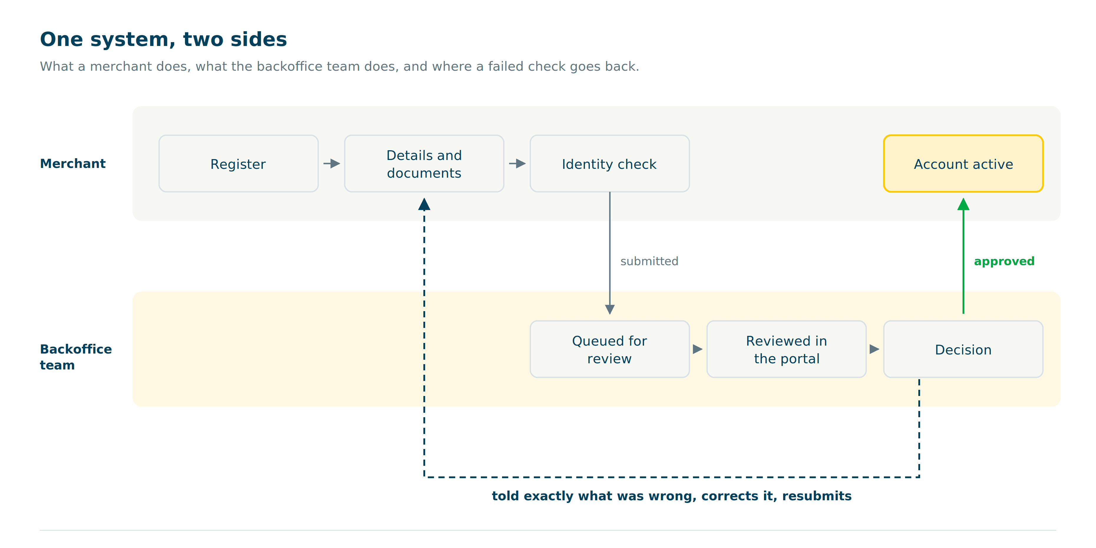
Goal three. A portal for the team deciding who gets in, built for volume and built to let people back in.
Built for volume
The design system had been built for the consumer product, so its components assumed a customer rather than a reviewer. Extending it to the portal meant working out, screen by screen, what could carry over and what needed to be built.
Reviewers can work vet, pull reports, and see everything about a client in one place instead of across several systems.
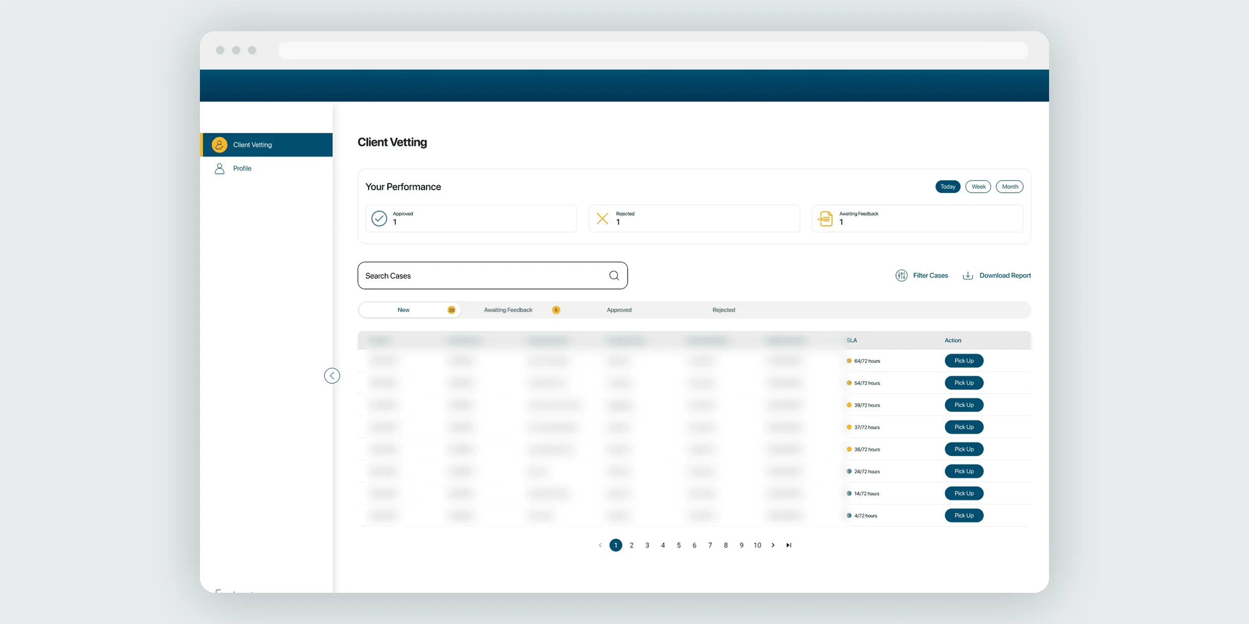
The queue a reviewer opens on. Their own performance up top, cases below, and an SLA countdown on every row so the oldest case is visible at a glance.
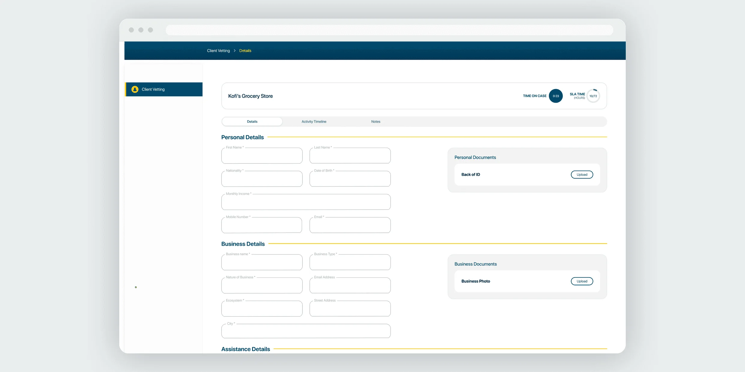
One case, in one place. Details, documents and the decision all on the same screen.
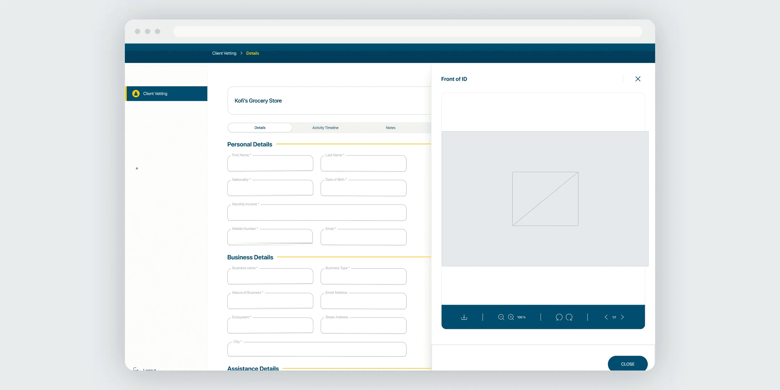
Documents open beside the case rather than in a separate tab, so a reviewer can say precisely what was wrong with one. The document itself is withheld here.
Designing for a second chance
The part of the portal I cared about most is what happens when vetting fails. A failed check is usually not fraud. It is a typo, a blurry document, an old address. Treating that the same as a real rejection loses good customers and gives them no way back.
So I designed the portal around communication, not just decisions. Reviewers tell a client exactly what was wrong, and the client corrects it and resubmits.
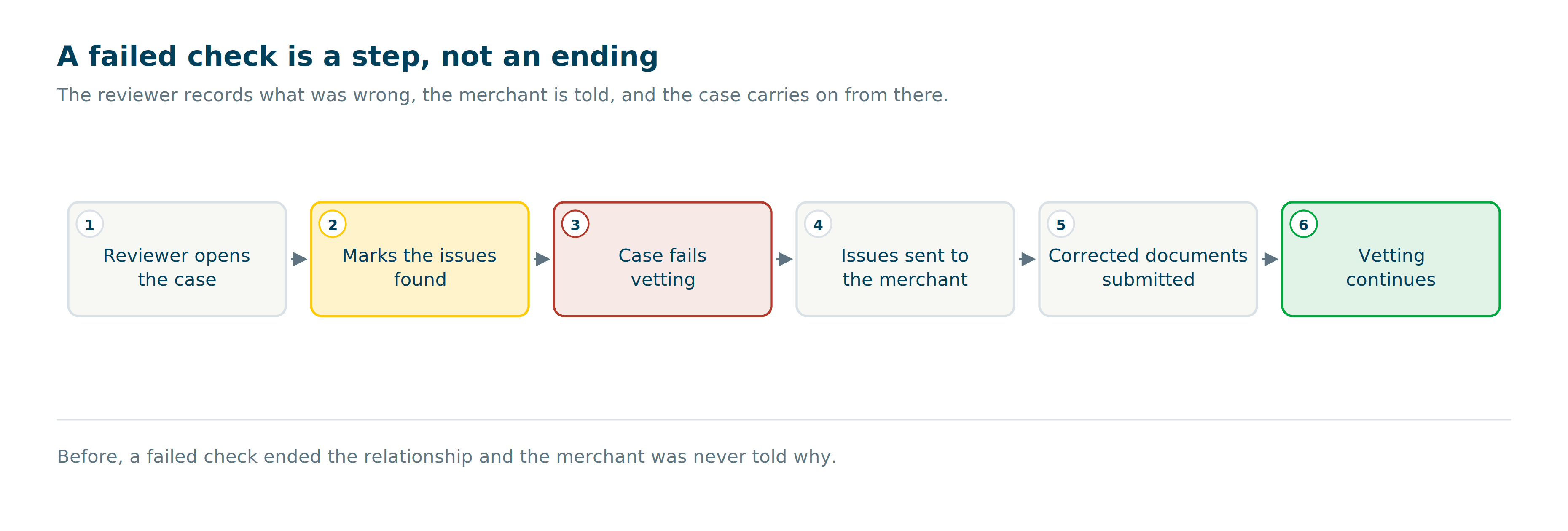
More for a reviewer to do per rejection, in exchange for keeping customers who would otherwise have been lost.
What we delivered
- Onboarding on web and mobile, in four markets, built on one shared foundation
- A vetting portal handling review, reporting and client communication together
- An early onboarding site for Uganda, ahead of the full rollout
Against the three goals: people can now sign up without an agent, on either platform. Four markets run on one structure instead of four products. And a client who fails a check gets told why and can fix it, rather than meeting a closed door.